Wednesday, May 18, 2016
Saturday, May 14, 2016
User Testing 11
For the user testing I conducted on the 13th of May, I
narrowed down the remaining designs and had people rank them in order of
preference. I showed them the 5 most popular designs and they looked through
them and then ranked them 1-5, with one being the favourite and five being the
least favourite.
While no one of them received all positive or negative marks
there were a few that people like a lot. Like with my previous ranking test, I
added up the marks given to each design and checked which had the lowest mark
out of all of them to determine the most well received one. I would've
preferred to have had more than ten people test it just to try and get as large
a group as possible to get the most accurate results for this test. The one
that was most popular was one from the "All Mine" colour scheme, it
was mainly a red and cream design while the least popular design was from the
"Coal Mine" colour scheme which had more darker colours to it, like
black and grey.


Wednesday, May 11, 2016
User Testing 10
For the user testing I conducted on the 10th of May, I
continued on with colour schemes and their distribution. I had people take a
look at several versions of each of the three colour schemes distributed
differently to see what people's reactions were and what they thought could
work, didn't work or could be changed to improve it.
A lot of people hated the brighter colours being used
prominently and thought that they would work better when used sparingly like
the blue colours in the scheme "All Mine" or the greys in
"Diamond Mine". The majority also seemed to like the ones with a
white background or an off white background (the creams and the light greys)
more than the coloured backgrounds (like the greens, blacks and blues). Our
next step will be to narrow down the preferred designs and have people rank the
remaining designs to try and finalize our design.
Here are some examples of what I tested:


Here are some examples of what I tested:


Tuesday, May 10, 2016
User Test 9
For the user testing I conducted on the 9th of May, I
expanded on the previous test of people's opinions of the colour schemes. My
group and I reviewed the remarks made on each of the colour schemes and took
out the ones that received the most negativity. I then showed a list of them to
a series of users and had them rank them from favourite to least favourite to
further narrow them down. We added up the numbers that each person assigned
them, with one being favourite and nine being least favourite. With the numbers
added up we reviewed their total value, with the lower the value the more
popular it was and vice versa. We narrowed them down to the three most popular
colours to test further. Our next step for this will be to distribute each
schemes colours in a basic layout to see what people think of some of the
colour distribution of those colour schemes.


Thursday, May 5, 2016
User Test 8
For the user testing I conducted on the 4th of May, I had
people test the app's basic functionality. I recorded them going through the
app and asked them if they found anything not that intuitive or confusing and
made note of it. Some of the users didn't grasp the terminology right away but
they understood it as they used it or when I explained it to them after they
asked what it meant. Some problems I encountered were the browser not picking
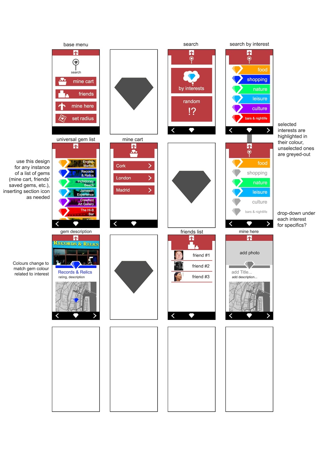
up my location meaning that the users were unable to use the map at all. But
they grasped how the app works and what each tab and button was for.
Tuesday, May 3, 2016
User Test 7
For the user testing I conducted on the 2nd of May, I had
five people look at various colour schemes and some logo designs and get their opinions on them one
at a time. I showed them each of the colour schemes one at a time and took down
their thoughts on them. We got a similar response on several of the colour
schemes, such as a green looking quite militaristic or like camouflage. Another
consensus was that some of the ones with a splash of a bright colour with
darker ones were well received. Most of the users didn't care for the
predominantly darker schemes. Some of the results varied a bit but for the most
part people liked and disliked the same colour schemes. After I had showed them all of the colour schemes I showed them several logo designs we had for Pickaxe. The most well received was version three of the logo, while most people seemed to dislike version five.
Monday, May 2, 2016
New logo and colour scheme treatments
Rough of logo for app icon purposes, plus colour scheme roughs with the new logo added in. Still some tweaks to be made, and testing to be done before finalising the design, but I think it's getting there. Next step: creating some stylesheets and organising the assets for the working version of the app prototype.
Subscribe to:
Posts (Atom)