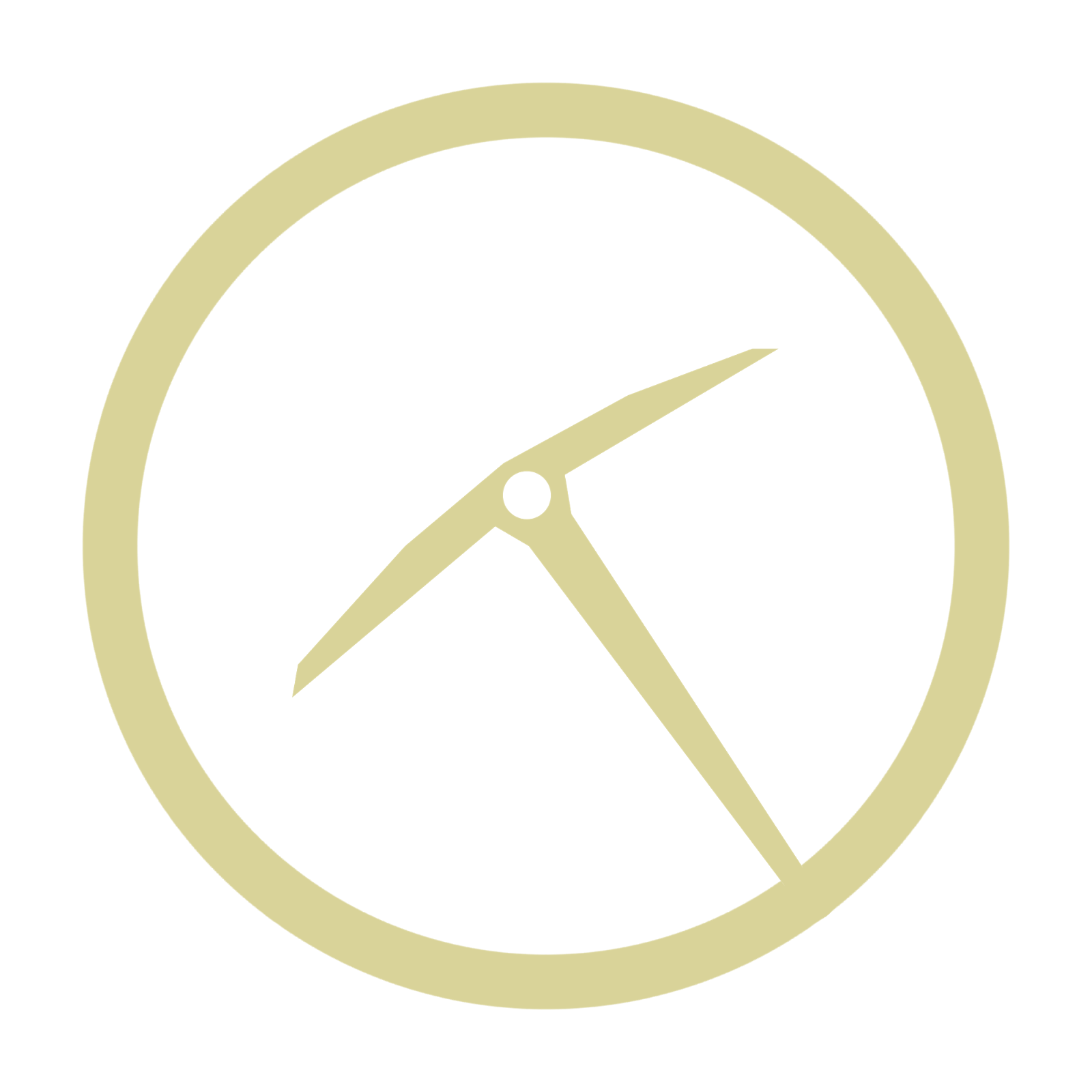
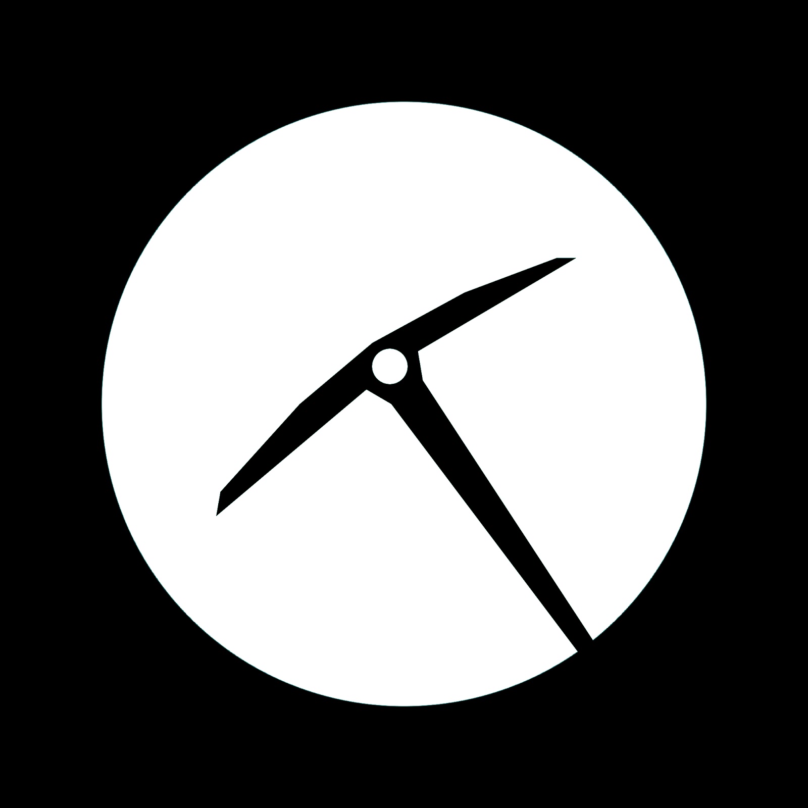
Some logo ideas I came up with to look more smooth and flow with the app. I also collected a number of color schemes for testing which related to the word "mine" off adobe kuler.
For the user testing I conducted on the 13th of May, I
narrowed down the remaining designs and had people rank them in order of
preference. I showed them the 5 most popular designs and they looked through
them and then ranked them 1-5, with one being the favourite and five being the
least favourite.
While no one of them received all positive or negative marks
there were a few that people like a lot. Like with my previous ranking test, I
added up the marks given to each design and checked which had the lowest mark
out of all of them to determine the most well received one. I would've
preferred to have had more than ten people test it just to try and get as large
a group as possible to get the most accurate results for this test. The one
that was most popular was one from the "All Mine" colour scheme, it
was mainly a red and cream design while the least popular design was from the
"Coal Mine" colour scheme which had more darker colours to it, like
black and grey.
For the user testing I conducted on the 10th of May, I
continued on with colour schemes and their distribution. I had people take a
look at several versions of each of the three colour schemes distributed
differently to see what people's reactions were and what they thought could
work, didn't work or could be changed to improve it.
A lot of people hated the brighter colours being used
prominently and thought that they would work better when used sparingly like
the blue colours in the scheme "All Mine" or the greys in
"Diamond Mine". The majority also seemed to like the ones with a
white background or an off white background (the creams and the light greys)
more than the coloured backgrounds (like the greens, blacks and blues). Our
next step will be to narrow down the preferred designs and have people rank the
remaining designs to try and finalize our design.