Showing posts with label Evan. Show all posts

Saturday, May 14, 2016

User Testing 11

For the user testing I conducted on the 13th of May, I narrowed down the remaining designs and had people rank them in order of preference. I showed them the 5 most popular designs and they looked through them and then ranked them 1-5, with one being the favourite and five being the least favourite.


While no one of them received all positive or negative marks there were a few that people like a lot. Like with my previous ranking test, I added up the marks given to each design and checked which had the lowest mark out of all of them to determine the most well received one. I would've preferred to have had more than ten people test it just to try and get as large a group as possible to get the most accurate results for this test. The one that was most popular was one from the "All Mine" colour scheme, it was mainly a red and cream design while the least popular design was from the "Coal Mine" colour scheme which had more darker colours to it, like black and grey.


Wednesday, May 11, 2016

User Testing 10

For the user testing I conducted on the 10th of May, I continued on with colour schemes and their distribution. I had people take a look at several versions of each of the three colour schemes distributed differently to see what people's reactions were and what they thought could work, didn't work or could be changed to improve it.


A lot of people hated the brighter colours being used prominently and thought that they would work better when used sparingly like the blue colours in the scheme "All Mine" or the greys in "Diamond Mine". The majority also seemed to like the ones with a white background or an off white background (the creams and the light greys) more than the coloured backgrounds (like the greens, blacks and blues). Our next step will be to narrow down the preferred designs and have people rank the remaining designs to try and finalize our design.

Here are some examples of what I tested:


Tuesday, May 10, 2016

User Test 9

For the user testing I conducted on the 9th of May, I expanded on the previous test of people's opinions of the colour schemes. My group and I reviewed the remarks made on each of the colour schemes and took out the ones that received the most negativity. I then showed a list of them to a series of users and had them rank them from favourite to least favourite to further narrow them down. We added up the numbers that each person assigned them, with one being favourite and nine being least favourite. With the numbers added up we reviewed their total value, with the lower the value the more popular it was and vice versa. We narrowed them down to the three most popular colours to test further. Our next step for this will be to distribute each schemes colours in a basic layout to see what people think of some of the colour distribution of those colour schemes.


Thursday, May 5, 2016

User Test 8

For the user testing I conducted on the 4th of May, I had people test the app's basic functionality. I recorded them going through the app and asked them if they found anything not that intuitive or confusing and made note of it. Some of the users didn't grasp the terminology right away but they understood it as they used it or when I explained it to them after they asked what it meant. Some problems I encountered were the browser not picking up my location meaning that the users were unable to use the map at all. But they grasped how the app works and what each tab and button was for.


Tuesday, May 3, 2016

User Test 7

For the user testing I conducted on the 2nd of May, I had five people look at various colour schemes and some logo designs and get their opinions on them one at a time. I showed them each of the colour schemes one at a time and took down their thoughts on them. We got a similar response on several of the colour schemes, such as a green looking quite militaristic or like camouflage. Another consensus was that some of the ones with a splash of a bright colour with darker ones were well received. Most of the users didn't care for the predominantly darker schemes. Some of the results varied a bit but for the most part people liked and disliked the same colour schemes. After I had showed them all of the colour schemes I showed them several logo designs we had for Pickaxe. The most well received was version three of the logo, while most people seemed to dislike version five.


Tuesday, April 19, 2016

User Test 6

For the user testing I conducted on the 18th of April, I had five people tell me what their favourite and least favourite colours were from the list I had given them. I also asked them if they had any other comments about the colours shown to them. The test took place in a common environment for the users. The most common consensus was that number 2 was the one most people liked. Another results was that some of the users didn't really like the brighter colours.


Thursday, April 7, 2016

User Test 5

For the user testing I conducted on the 6th of April, I asked five people to take part in the test. The test took place in a familiar location for the users. One by one, I asked them to look at a colour palette that Calum had made and asked which colours they liked, didn't like and why. After that was done I showed them a basic design layout with the colours from the swatches. I then asked them which colour they liked again seeing if their opinion changed when they saw it in the design.

One or two changed their opinion on colours they had previously disliked when they were shown to them in the basic layout. But most of the users opinions stayed the same. They also commented on the design which gave some helpful feedback for Calum, like some of the gem icon being too big or that it doesn't resemble a gem very well. Two users also commented on two different colours and thought they reminded of Pokémon.


The results were quite varying, some people saying they preferred the darker colours to the light ones and others saying the opposite of that. The one thing everyone one agreed on was the bright red colour for the gem in the design.


Thursday, March 31, 2016

User Test 4

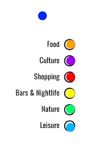
For the user testing I conducted on the 16th of March, I asked 7 people to take part in the test. One by one, I had them fill in a photoshop document to determine what categories fit best with certain colours. While we did have a set amount of colours ready we encouraged the testers to use a colour that wasn't there if they didn't feel the given colours complimented the categories.

The testers all had a basic understanding of using photoshop, though if we were to ask more people and they were not able to use photoshop we planned on using photoshop for them and put the colours with the categories they wanted. While most of the testers used the colours given, a few used colours that they thought would work better. I also had to reset the document when a new user was using testing it so that they wouldn't have their answers influenced by the previous tester.


From the results received, two of the categories were given the same colour every time by each user, one was expected, green for nature but the other was orange for food which I thought was interesting. Leisure almost received all the same colour each time (sky blue) but two other times the other blue colour was chosen. Shopping, Bars & Nightlife and Culture had the most varying results from person to person. Several of the testers even stated that they thought Culture was the hardest one to pick for.


User Test 3

For the user testing I conducted on the 8th of March, I used a technique called "Tree Testing". I recorded five people putting features on potential pages that they felt would be on those pages. We had different options for them to choose from and also had blank pieces of paper that they could use to add any features they thought should be included on the pages.

We discovered some minor problems with some of the options given, we used a buzz word from our app that some of the users weren't familiar with and had to explain it to them but after that they understood what was meant by it. One also asked several other questions about how the pages connect to each other and was thought it could be made clearer.

The layouts that we got back were similar to the ideas we had been contemplating but with some differences and user-added features that the users came up with. We tried having the cards laid out slightly differently so that we were not forcing the users into our way of thinking. But I think that giving them the page's hierarchy would help them understand how it would work. We had one outlier that had the app laid out as more of a social media app rather than the use we have planned for it, but it just reinforced the idea that we should include a social aspect to the app.


We also included the user created options in each of them following tests and in all cases the each tester used at least one of the previous testers ideas. We weren't sure whether or not to include the users own ideas in the following tests, to see if they would come to a similar conclusion on their own, but we did end up using them to give the testers more options and not force them into using only the ideas that we had made for them. If I were to conduct the test again, I wouldn't include the user made options to see if the other testers would make similar options as the previous tester.


Wednesday, March 30, 2016

User Test 2

For the user testing I did on the 29th of February, I got seven people to fill out a questionnaire to several questions that we were looking for the answers to, in regards to some of the functionality of our app. When I got the questionnaires back, I recorded the data into a spreadsheet.

The testing took place in a familiar environment to the users and they filled out the questionnaire individually, I was in the room with them to answer any questions that they may have had. Several of the users had problems understanding the phrasing of one of the questions, which we ourselves had trouble writing in the first place. I explained the question to users so that they would be able to continue on with the questionnaire.

None of the answers were really all that different than what we were expecting as they questions were all quite basic like "How often do you travel in a year?". One answer that stood out to me was one for the question "What comes to mind when you hear the word Pickaxe?". The answer we got was "The sound it makes when it hits rocks". Which I thought was quite different from the other answers which were all kind of similar, like mining, gems, etc.