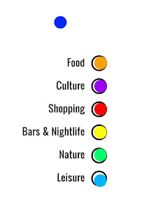
For the user testing I conducted on the 16th of March, I
asked 7 people to take part in the test. One by one, I had them fill in a
photoshop document to determine what categories fit best with certain colours.
While we did have a set amount of colours ready we encouraged the testers to
use a colour that wasn't there if they didn't feel the given colours
complimented the categories.
The testers all had a basic understanding of using
photoshop, though if we were to ask more people and they were not able to use
photoshop we planned on using photoshop for them and put the colours with the
categories they wanted. While most of the testers used the colours given, a few
used colours that they thought would work better. I also had to reset the
document when a new user was using testing it so that they wouldn't have their
answers influenced by the previous tester.
From the results received, two of the categories were given
the same colour every time by each user, one was expected, green for nature but
the other was orange for food which I thought was interesting. Leisure almost
received all the same colour each time (sky blue) but two other times the other
blue colour was chosen. Shopping, Bars & Nightlife and Culture had the most
varying results from person to person. Several of the testers even stated that
they thought Culture was the hardest one to pick for.


No comments:
Post a Comment